In this section

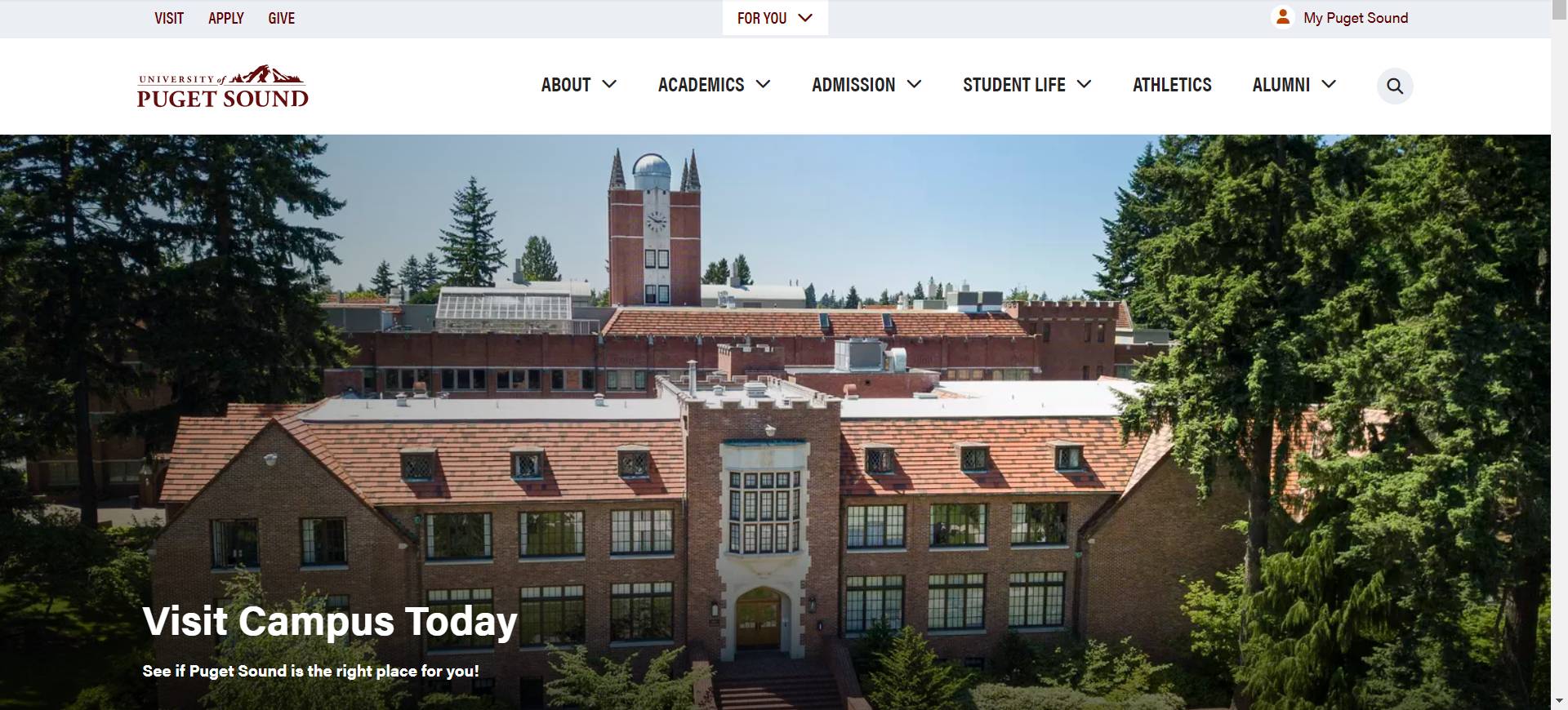
In September 2024, we will be launching some updates to the university website. After careful analysis with a web performance firm, some design changes have been made to improve the user experience on our site. The most noticeable changes are highlighted below. 

Global Navigation

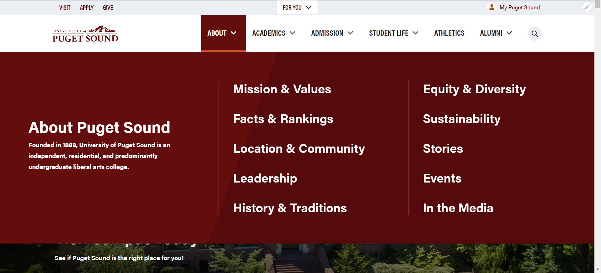
As with the current site, the global navigation will remain focused primarily on the experience of our prospective students and their families, leading to high level information oriented toward those audiences. (Our internal audiences will find more detailed information about the university in the audience gateways, now under the For You menu.)

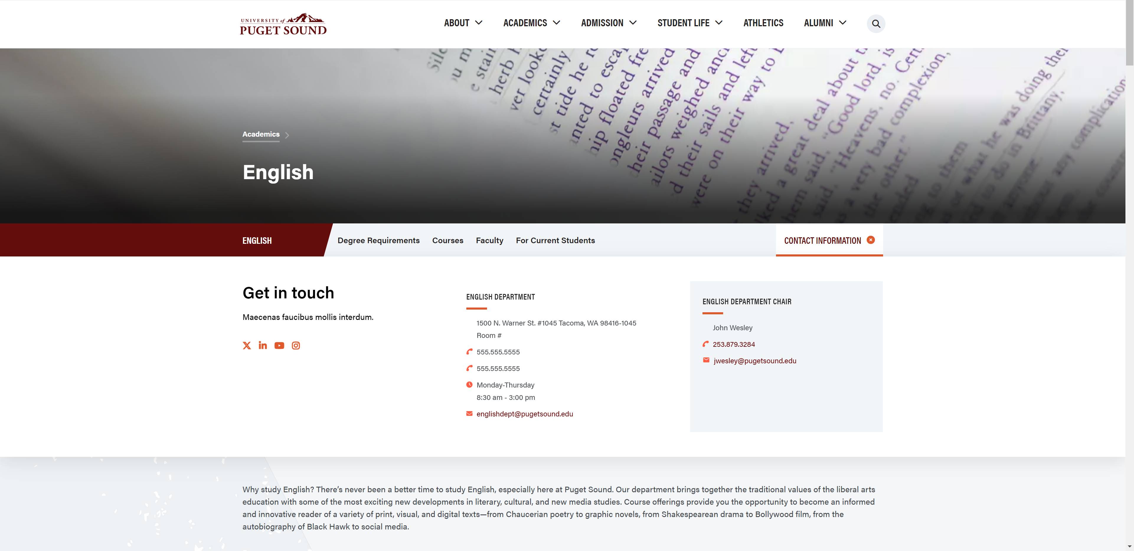
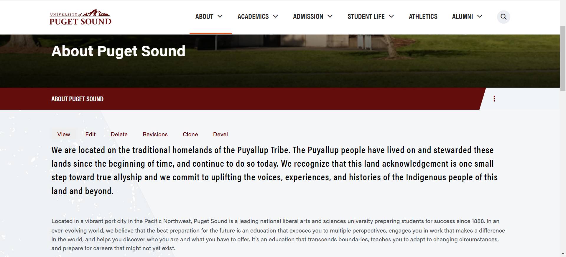
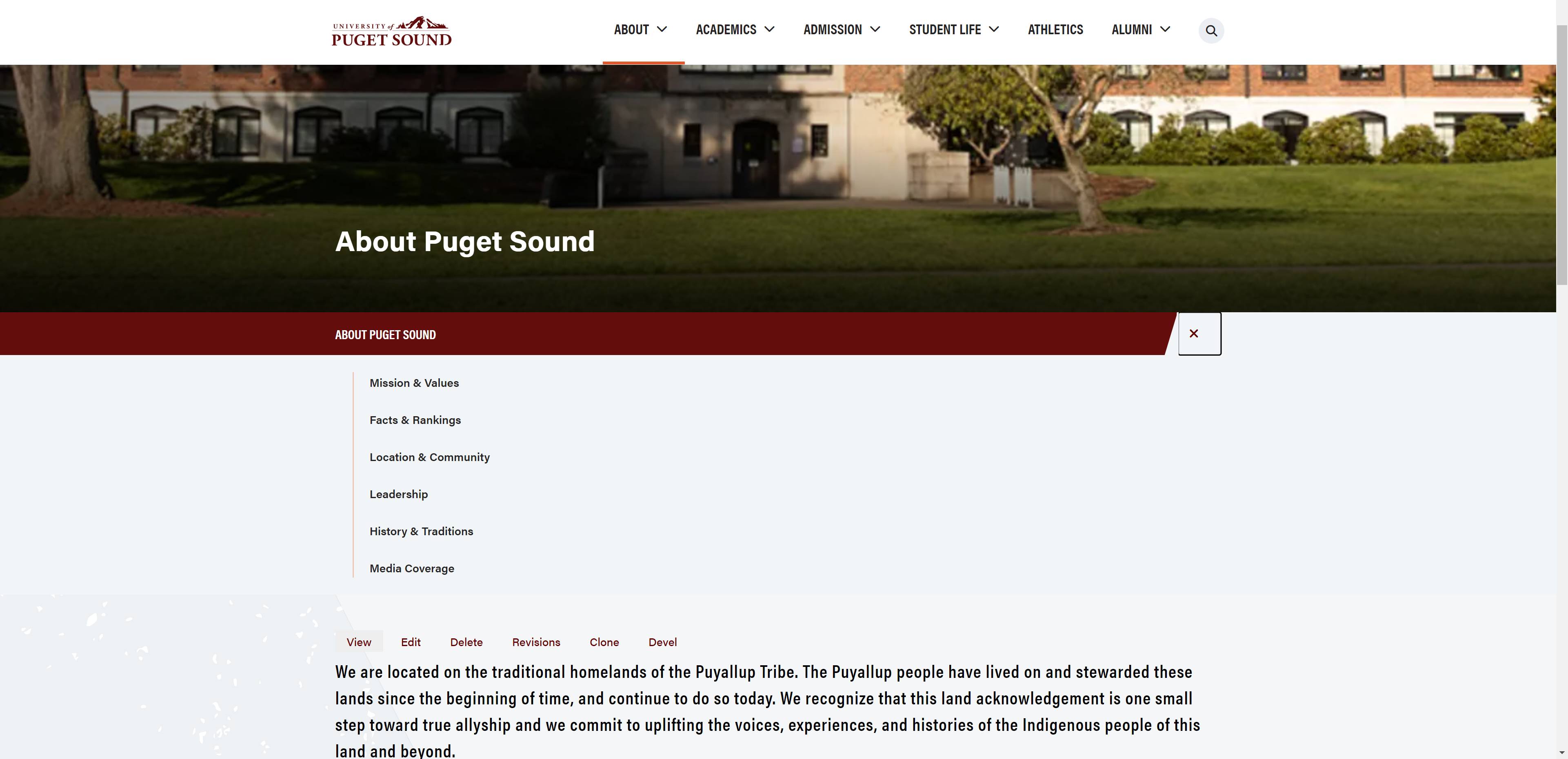
  • The overall look of the nav bar has been lightened, including changing maroon for white and using the horizontal logo.
  • The secondary nav has been eliminated, as it cluttered and complicated the global nav area, and analytics showed most of those links were rarely used. Athletics has been added to the global nav, and the other options are available through the other global nav areas.
  • The audience gateways are now available under the For You menu at the top of the page. 
Screen capture of the university website featuring the top of the home page.

Rollover Navigation

Our global nav still has rollover access to the sections in each area, but a few adjustments have been made based on the recommendations of the web firm. 

  • The rollover navigation items appear larger for easier viewing and accessibility.
  • The rollover navigation items and the title of the callout in the rollover navigation have been changed to mixed case instead of all caps, for easier readability.
Screen capture of the university website showing the rollover navigation.

Page Header Options

There have been a few changes to the header options on each page, some of which will be highlighted here and below in the contact information section.

  • The header image at the top of each page will now have 3 options: Tall, short, or no image. In each case a title, brief optional text, and optional 1 or 2 callout buttons appear ON TOP of the header image. (As you will see in later examples, on lower level pages, the revised breadcrumbs will also appear on top of the image.)
  • Below the header image, every page will have the option to display a strip of callouts that don't have images attached to them. This display can have up to four columns, including a title area and up to 3 callouts with a title, brief text, and an optional link.
Screen capture of the university website showing the header and calls-to-action under the banner graphic.

Sub/Local Navigation + Contact Information

Any pages with subnavigation levels will display local navigation below the header image (or space, if no image was selected). 

  • This example also shows the new revised breadcrumb positioning, above the title over the header image.
  • The left maroon part will pull the parent label from the menu system.
  • Pages with up to five local navigation items will have the menu options displayed in the gray part of the bar adjacent to the maroon menu label. (See below for an example of a page with more than 5 subnavigation items.)
  • The last example below shows the default display option for pages with more than 5 subnavigation items. If a page has more than 5 items in its subnavigation, the system will automatically display it as the mobile navigation menu that can be expanded with a click.
  • The contact box that was previously available for display in a right-side column has been traded for a Contact Information accordion option attached to the local navigation bar. The button turns orange when you mouseover it and expands to show the contact information when it is clicked. See below for an image of the contact information in expanded form.
  • The expandable Contact Information box can have up to four columns, starting with a title area that can include social media icons and up to 3 contact blocks. The preferred default option for contacts can be shaded gray as in the second example below.
Screen capture of the university website showing the top of a page including the local navigation


Screen capture of the university website showing a lower level page with contact block expanded.


Screen capture of the university website showing a lower level page with rolled up local navigation.


Screen capture of the university website showing an expanded view of the local navigation.

Other Display Changes

You may notice a number of other visual changes to the way the website is displayed, as in the example below.

  • The styled bullets have been changed from chevrons/arrows to dashes to eliminate any confusion with expandable content functionality. 
  • The accordion controls have also been changed from arrows to plus signs for consistency. In addition, the all-cap font treatment on the accordion labels have been exchanged for mixed case text for easier readability.
  • A number of the maroon accents on elements in the site have been reduced or removed, leaving a lighter presentation for the site overall. 
  • Several of the heading styles have been adjusted to use mixed case text instead of all caps for readability throughout the site.
Screen capture of the university website showing changed bullet treatment and accordion option.